The Beatitudes
Ashendene Press Style
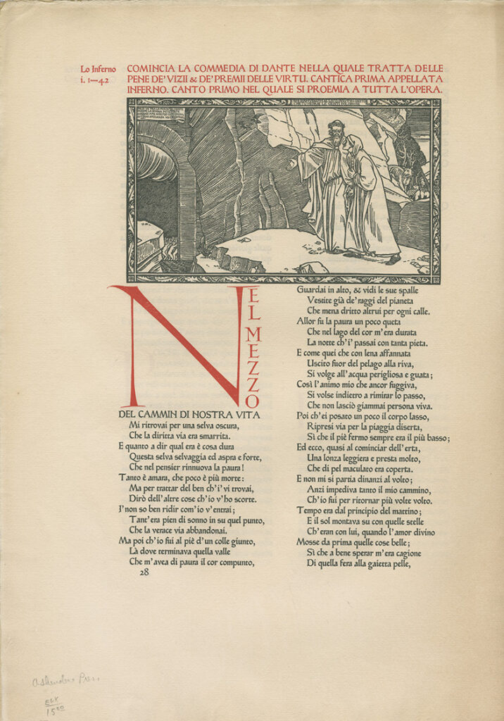
The Ashendene Press, established in 1894 by C.H. St John Hornby, was renowned for its refined typographic craftsmanship and restrained yet elegant book design. Inspired by early Renaissance printing traditions and medieval manuscripts, Ashendene’s books emphasized clarity, simplicity, and visual harmony. The press employed subtle rubrication, carefully chosen colors, and spacious page designs, making each page a meditation in typography. One of its most celebrated works includes Dante’s “Inferno,” renowned for its exquisite layout and elegant woodcut illustrations.
Artistic Intent

This digital recreation of “The Beatitudes” (Matthew 5:1–12) honors the Ashendene Press aesthetic by embracing minimal yet meaningful decoration. The rubricated red title, combined with deep-blue pilcrows marking each Beatitude, create a rhythmic and contemplative visual flow. The careful use of color reflects the historical tradition of illuminated liturgical manuscripts, subtly inviting meditation and prayerful reflection.
The piece concludes with the Latin phrase ✠ Ad Majorem Dei Gloriam ✠ (“To the Greater Glory of God”), framed with an Ashendene-inspired ornamental flourish, emphasizing its devotional and spiritual purpose.
This work continues the artistic dialogue begun with my earlier recreation of Ashendene’s page from Dante’s “Inferno,” further exploring the Press’s typographic legacy.
Bring This Piece Into Your Space
“The Beatitudes – Ashendene Press Style” is available as a fine art print through Fine Art America. Perfect for devotional spaces, libraries, or thoughtful gifting, this artwork enriches any setting where tradition and typographic beauty are cherished.
Reflective Note
In designing this page, my intention was to create a quiet yet resonant artwork that draws viewers into contemplative reflection. May this homage to the Ashendene Press inspire peace and devotion through its harmonious blend of sacred text and typographic craftsmanship.